
WILDRIDE CARRIER
UI/UX Design for WildRide Carrier, E-commerce website - Lead Designer
As the lead UI/UX designer, I led the project from research and wireframes to interactive prototypes and final design. I worked alongside my team to redesign our client’s existing e-commerce website using best practices.
Platoform:
Shopify
Duration:
8 weeks
Tools:
Figma
Lead UI/UX Designer ,
Discovery, User research,
Visual and Motion design, Testing
My role:
Lo-fi prototype & Hi-fi prototype
Deliverables:
Summary of User Research
During the UX research phase for this project, we recruited users who were already customers of WildRide but also we found some new users who fit the criteria of possible end users, created the interview questions, and performed the interviews.
During the UX research phase for WildRide, users expressed frustration with complex navigation and limited product information especially regarding safety and instructions of the baby carrier. Users emphasized the importance of a seamless and intuitive shopping experience, including streamlined navigation, comprehensive product details, simplified checkout processes and responsive mobile optimization.
Insights found during the interview:
1) Busy parents who lead active lifestyles often face challenges when it comes to carrying their babies while engaging in various activities such as hiking, shopping, or attending events.
2) Customers expressed a strong desire for a detailed product description including fabric composition, care instructions, and safety regulations.
3) Customers expressed concerns when navigating through e-commerce websites to find the right baby carrier can be overwhelming due to the abundance of choices and lack of clear information on features and benefits.
The problem
The paint point and how to solve it
Detailed Product Descriptions: The goal is to solve this pain point by providing comprehensive and easily understandable descriptions for each baby carrier, highlighting key features such as ergonomic design, materials used, weight capacity, and safety certifications.
High-Quality Images and Videos: Included high-resolution images and videos showcasing the baby carriers from multiple angles and demonstrating how to properly use and adjust them. This visual content will give parents a better understanding of the product and its features, helping them visualize how it will fit and function in real-life
Lack of Personalization: The goal is to solve this problem by generating dynamic recommendations based on users' preferences, such as preferred carriers, features, and price range. These recommendations will appear prominently on the product detail page, guiding users towards relevant product combinations and offers.
Slow ordering process: The goal is to solve this pain point by offering a better and easier way to order snacks without investing too much time in the process. Ordering should be a clear, simple task to complete
The goal
Design a seamless online shopping experience for WildRide carrier’s customers, enabling them to effortlessly browse, select, and purchase items with clarity on the safety of the carriers, comprehensive product information, and fast checkout.
Time for wireframes
During the wireframe process, our primary focus was on addressing the pain points identified in WildRide Carrier's e-commerce experience. To enhance user satisfaction and facilitate informed purchasing decisions, we prioritized key areas such as the Product Detail Page, Collection Page, and Homepage.
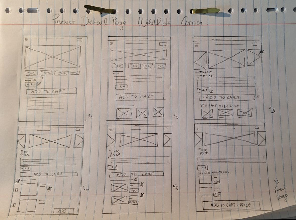
For the Product Detail Page, we concentrated on optimizing the layout to seamlessly integrate add-ons and complementary products. Through a user-friendly interface, customers can easily view additional accessories and related items, enhancing their shopping experience and encouraging upsells.
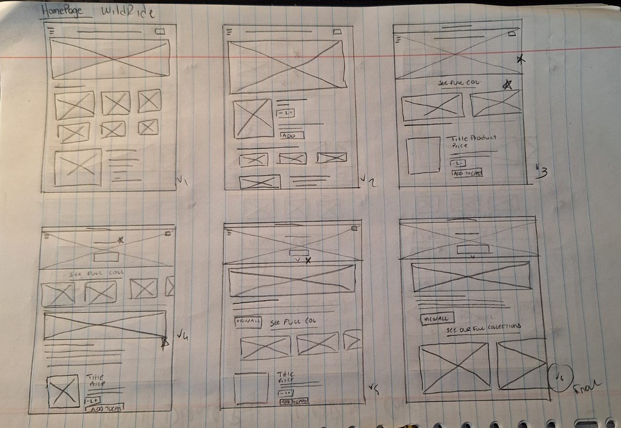
On the Collection Page, we implemented fast "add to cart" functionality to streamline the browsing and purchasing process. With a simple and intuitive design, users can swiftly add desired items to their cart without navigating away from the page, minimizing friction and improving efficiency.
Furthermore, we redesigned the Homepage to feature clear navigation pathways, ensuring easy access to essential sections of the website.
By focusing on these key aspects during the wireframe process, we aimed to address the identified pain points, fulfill the user problem statement, and achieve the goal of establishing WildRide Carrier as a premier destination for personalized and convenient baby carrier shopping.
dIGITAL WIREFRAMES
Lo-fi prototype usability findings
I based the screen designs on feedback from user research.
Easy navigation and consistent sizing were the key user needs to address in the designs.
The ability to adjust orders on the cart page was also one of the user needs to address in the designs


Hi-fi prototype usability findings

Customers were interested more in the product information than the product bundles, so we changed the layout of the product detail page
Added an advanced pop-up with more information about the add-on product. This functionality was much needed based on users feedback

These two points were crucial for the design of WildRide Carrier due to the following reasons:
Product Information Priority: By recognizing that customers were more interested in product information than product bundles, we adjusted the layout of the product detail page to meet their needs.
Enhanced Add-On Information: The addition of an advanced pop-up with more information about add-on products was necessary based on user feedback. This functionality addresses a specific pain point identified through user interaction and feedback, indicating a demand for comprehensive details on additional accessories or related items.
Μock ups

Primary Navigation
By streamlining the main navigation -we were able to have our client's customers reach their desired page in two clicks instead of five.
The previous navigation system lacked crucial information, such as links to collections, creating confusion for customers trying to navigate to the correct pages and resulting in unclear product research. To address this issue, we implemented a best practice by introducing a mega menu. This enhancement streamlined the user experience by providing a comprehensive menu structure, and users were seamlessly directed to a newly constructed category page, improving the overall clarity and efficiency of product research.


Takeaways
Impact: The changes implemented in WildRide Carrier's e-commerce platform have significantly enhanced the user experience and satisfaction levels.
One quote from user feedback:
"I love how easy it is to find detailed information about each product on WildRide Carrier's website. The layout is intuitive, and the addition of the advanced pop-up for add-on products is incredibly helpful!"
What I learned:
Through the redesign process, I learned the importance of prioritizing user needs and feedback. By iterating on the design based on user input, we were able to make meaningful improvements that directly addressed user pain points and preferences.
Next Steps:
One next step I'd like to take is to conduct further usability testing to ensure that the changes have effectively addressed any remaining pain points and continue to enhance the overall user experience. This iterative approach ensures that the platform remains responsive to user needs and maintains high levels of user satisfaction over time.