
Jan en juup
UI/UX Design, E-commerce website, Lead Designer
As the lead UI/UX designer, I led the project from research and wireframes to hi-fi prototypes and final design. I worked alongside my team to design an e-commerce website using best practices and fulfil our clients needs.
Platoform:
Shopify
Duration:
10 weeks
Tools:
Figma
Lead designer – discovery, user research, visual and motion design, testing
My role:
Lo-fi prototype & Hi-fi prototype
Deliverables:
Summary of User Research
Our user research for the Jan & Juup webshop aimed to gain insights into the preferences, behaviors, and pain points of our target audience. Through a combination of surveys, interviews, and usability testing, we gathered valuable data that informed the redesign process. The most common pain points identified include difficulty finding desired home decor items due to poor categorization and search functionality. This lack of visibility leads to frustration and potential abandonment of the shopping process.
We also concluded that users appreciate visually appealing product presentations, including high-quality images and detailed descriptions. They also value personalized recommendations and curated collections that align with their style preferences.
The problem
Insights derived from our research with Jan & Juup users:
Users struggle with finding specific home decor items due to inefficient product categorization and search functionality, leading to frustration and potential abandonment of the shopping process.
There is a clear demand for quick access to product variants and a streamlined purchasing process. Users desire features such as quick buy buttons and prominently displayed product variants on the collection page to enhance usability and improve conversion rates.
Personalization plays a significant role in enhancing the user experience. Users appreciate personalized product recommendations based on their browsing history, preferences, and past purchases, which can lead to increased satisfaction and loyalty.
Users value detailed product descriptions and reviews when making purchasing decisions. Including high-quality images, comprehensive descriptions, and user reviews can provide users with the information they need to make informed choices and build trust in the brand.
The paint point and how to solve it
1. Limited Product Selection:
Pain Point: Users struggle to find suitable home decor items tailored to their specific preferences.
Solution: Implemented advanced filtering options allowing users to narrow down their search based on factors such as color, style, material, and price range.
2. Incomplete Product Information:
Pain Point: Users express frustration over inadequate product descriptions, including missing details on materials and dimensions, hindering their ability to make informed purchasing decisions.
Solution: Enhanced product descriptions with comprehensive details including materials, dimensions, care instructions, and any other relevant specifications. Incorporate high-quality images showcasing the product from multiple angles and in different contexts to provide users with a better understanding of the item's appearance and scale.
The goal
Our goal was to establish a seamless shopping experience ensuring informed product selection, and confident purchasing decisions. This was achieved by curating an advanced filtering section, enhancing product information and providing accurate sizing guidance for furniture and other size-dependent products.
Time for wireframes
During the wireframing phase for Jan & Juup, our primary goal was to elevate the presentation of home collection information while implementing advanced filtering and categorization features for products. Our aim was to enable seamless navigation through the collection, accompanied by high-quality images. Additionally, we strived to integrate a quick-buy feature that showcased product variants directly on the collection page, eliminating the need for users to navigate to individual product detail pages.
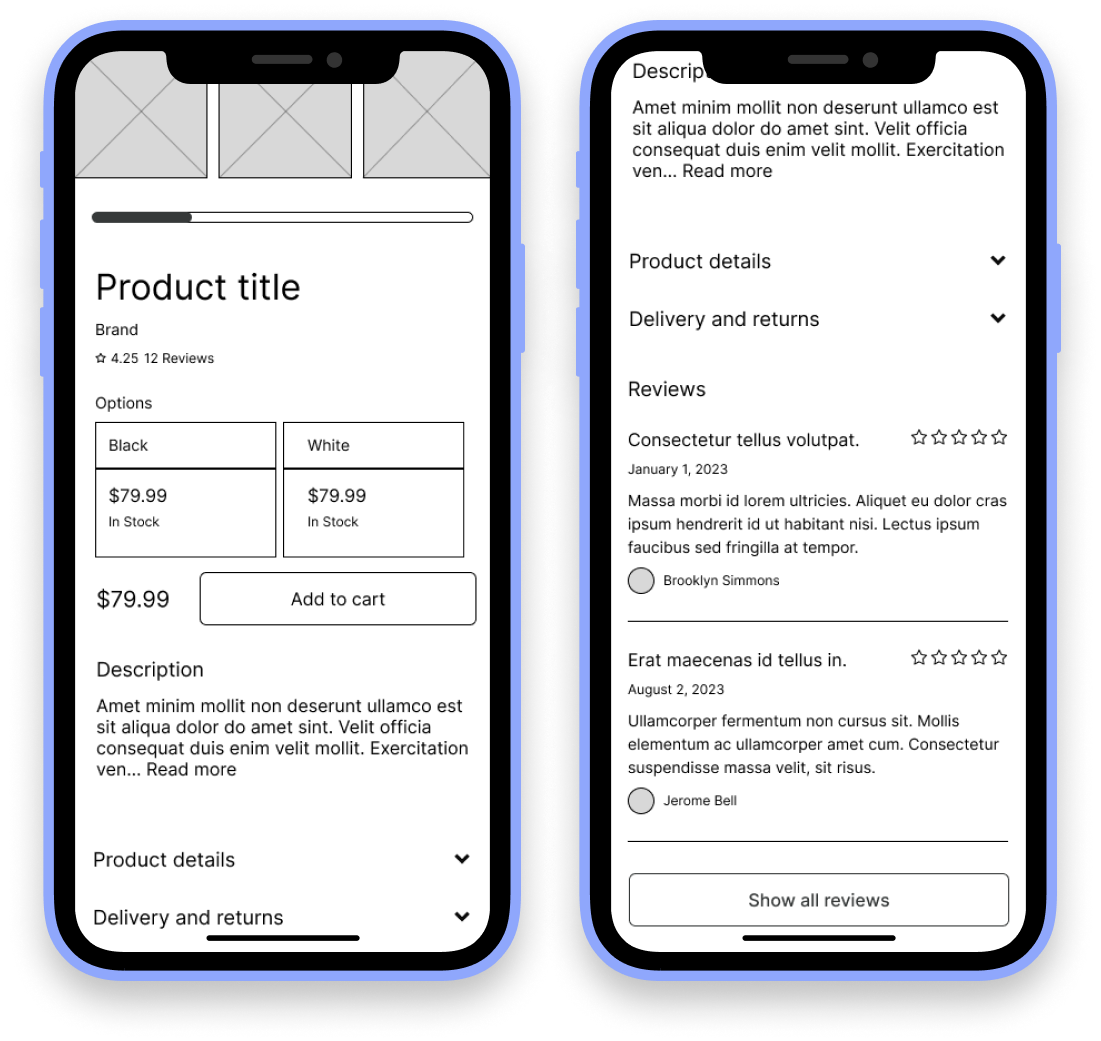
On the product detail page, I prioritized presenting a comprehensive overview of each product, Including detailed descriptions, variant options and user reviews can provide users with the information they need to make informed choices and build trust in the brand.. By focusing on these elements, I aimed to assist users in making informed purchasing decisions and alleviate any uncertainties about the products they were interested in.
On the homepage, we focused on enhancing the user experience for logged-in users by introducing additional blocks that showcase personalized products based on their preferences. By leveraging user data, we aimed to curate a tailored selection of items that align with their interests, thereby enhancing engagement and satisfaction.


dIGITAL WIREFRAMES
Lo-fi prototype usability findings
I based the screen designs on feedback from user research.
Display a very advanced filter on the collection page
Added a “My interest“ block on the homepage when user is logged in
Display clear size and color variants per product on product detail page for clear information


Hi-fi prototype usability findings
Following the completion of the usability study, we added several enhancements to the filter page based on user feedback. We added a Price range block, a back button, and a Show results button. These adjustments streamline the user experience and make the filter page more intuitive and user-friendly.
On the product detail page, we enhanced accessibility by adding color variants with corresponding image colors. Additionally, following usability testing, we integrated the Size Information section directly onto the product detail page. These adjustments aimed to streamline the user experience and ensure that users can easily access and comprehend important product information.


In light of user feedback and insights gleaned from usability testing, a pivotal improvement was implemented on the product detail page of our platform. By integrating the Color variant and Size block section directly onto the page, users now benefit from enhanced comprehension of sizing details, resulting in a notable reduction in clicks and smoother navigation across the platform. This strategic adjustment directly responds to user needs and significantly contributes to an overall enriched user experience on the website.

Accesibility considerations
Implemented color variants with corresponding image colors to assist users, including those with visual impairments, in accurately identifying their preferred color choice
Added icons to provide users with clear visual cues, facilitating easier identification of each feature.
We implemented a price range feature to cater to users with varying budget constraints. This allows users to set specific price parameters, making it easier for them to find products within their budget and ensuring a more inclusive shopping experience for all users.